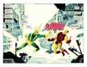
Thread #153261651

File: New_Avengers_001_03b.jpg (185.1 KB)

185.1 KB JPG
Some fans and comic creators have called Electro's costume "terrible", do you actually like it?
20 RepliesView Thread
 Showing all 20 replies.
>>
>>
>>
File: Daredevil - Yellow 004-003.jpg (2.1 MB)
2.1 MB JPG
it's fucking kino, it's the epitome of what Supervillain with a capital S should look like
>>
>>153261651
There's a way to make it work, and.... actually this isn't too bad at all.
But 99% of the time this costume is attempted, it looks fucking shite. even in 90s spider-man, they felt they had to explain that it was something an unfrozen guy from the 40s thought was an appropriate villain costume, while the guy wearing it objected.
>>
>>
>>153261651
I like his costume just fine. It's gaudy and over the top in a fun way.
I have a bigger issue with most of the attempts at giving him a "serious" outfit. It's usually the opposite problem; too minimalist and not very memorable, turning him into a generic looking electricity character instead of immediately screaming "Electro".
>>
>>
File: Spider-Man 009-006.jpg (1.4 MB)

1.4 MB JPG
>>153262598
>There's a way to make it work, and.... actually this isn't too bad at all.
What does it for me is the yellow stripes on his chest are "X" shaped instead of a "V" shape that goes down to the yellow trunks. Which is funny, tipically people say that they can't stand the star shaped mask, i never had a problem with it, it's the stripes that go down to the trunks that bother me.
>>
>>
>>
>>153261651
It's super stupid and I don't like it. However, it's his definitive costume as much as every other classic Spider-Man villain's costume is theirs. Attempts to make it cooler just don't work because the stupid thing is just too iconic and any changes carry the stink of trying to be less stupid, which inherently makes them less interesting.
>>
>>153261651
Yeah. I like my cape characters gaudy. When I hear 'lightning guy' I want that guy to either be made out of electricity or dressed up like a lightning bolt.
When you try to sand off the retarded elements you end up with something even more retarded like blue Jamie Fox.
>>
File: Spider-Man Chapter One 6.jpg (646 KB)

646 KB JPG
>>153264238
I prefer the star shaped mask because it's unique, even if you see it in silhouette it makes you think "that's Electro", in my opinion changing it sometimes makes Electro look generic, to me one of the worst offenders is the Byrne's revamp look
>>
>>
>>153261651
He is one of the extremely few early 60s villains that had an actual minute or two of thought put into his costume. In an era when 99% of them were just wearing green tights, or a purple jacket, or just a purple polo shirt. Electro had a decent themed costume.
>>
>>153264756
Yeah.... Even among the rest of the Spider-Man villains he stands out pretty well.
>Dock Ock has a plain green jumpsuit
>Mysterio has green footy pajamas with lines
>Sandman is just in a green shirt with lines
>Vulture is also in green footy pajamas with lines
>Rino is in gray footy pajamas
>Scorpion is also in green footy pajamas with lines
>Lizard just has a shirt and purple pants
There is a reason why Green Goblin and Venom stand out so well visually.
>>153264342
I feel like that plain triangle going down the torso is the most standard nothing design when the artist really cannot think of shit. Nearly every hero has something like that at some point.
>>
File: file.png (313.5 KB)

313.5 KB PNG
>>153264213
yeah the X really helps.. the stripes feel like fucking suspenders. Imagine wearing suspenders to hold up your underwear.
basically, for the star mask to work, you have to have basic geometric taste. and that's tricky because it's a curved flat piece. If you went as far as giving it three-dimensionality, then you'd fix the issue of the center bolt being asymmetrical, which always bugs me.
and if you do it lazily, it just looks like a floppy thing a court jester might wear.
>>
File: file.png (301.6 KB)

301.6 KB PNG
>>153264996
wait, I just realized I didn't cut into it at all for his actual cranium. so it'd be more like this.
>>