Thread #97897985

File: big_WIP_collage_16APR2026_x4000.jpg (3.8 MB)

3.8 MB JPG
Work in Progress, "Another Action-Filled Adventure" Edition
>Full-on /WIP/ OP Links Pastebin
https://pastebin.com/BE42AEcD
>WIP Tutorial Images Mega
https://mega.nz/#F!TvQFCaLb!w8WZKCcOsTRasxrI0JWezw
>Saint Duncan's "Six Things I Wish I Knew When I Started Painting"
https://www.youtube.com/watch?v=ufP8ka3KGno
>Saint Duncan also explains thinning your paints
https://www.youtube.com/watch?v=wxWgsqSf74s
>Paint thinning 102
https://www.youtube.com/watch?v=sBDVPoNXyVI
>4 EASY Chipping Tricks For Beginners
https://www.youtube.com/watch?v=ku4comhKHJM
>Decal Like a Pro
https://www.youtube.com/watch?v=SYKLiEW7p9c
>How to Edge Highlight
https://www.youtube.com/watch?v=KoRbYuAfbEk
>How to use contrast style paints
https://www.youtube.com/watch?v=IhholrozptI
>How to Paint with Tremors
https://www.youtube.com/watch?v=oqp76vAJu9g
>Airbrush Priming and Thinning
https://www.youtube.com/watch?v=jkntrSBvXxE
https://www.youtube.com/watch?v=IGjBQzoukFg
https://www.youtube.com/watch?v=00JVUxABe44
https://www.youtube.com/watch?v=AEqT_R41JX8
>Somebody has broken out of Satellite 2!
https://www.youtube.com/watch?v=Bzehb_yeZtU
>Who's Johnny, she'd say, and smile in her special way
https://1d6chan.miraheze.org/wiki/Johnny
>Previous Threads:
>>97883953
>>97873529
>>97858239
44 RepliesView Thread
 Showing all 44 replies.
>>
File: 20260416_161253.jpg (1.5 MB)

1.5 MB JPG
I guess I'll open with an early WIP of knights.
>>
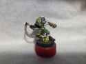
File: beherek.jpg (290.7 KB)
290.7 KB JPG
Just finished up by Beherek for an RTT this weekend. Had a lot of fun doing the gore on the back of the ork's head!
>>
File: 20260416_071545.jpg (1.9 MB)
1.9 MB JPG
Progress on my dude, any suggestions?
>>
File: Picsart_26-04-15_22-18-58-321.jpg (5.1 MB)

5.1 MB JPG
Repostin' last night's daemonsmith.
>>97897873
Honestly I probably won't, though it's good advice. Every time I try that on my green flames they always seems to lose their luster to me. It's completely a personal preference to just keep the brightest spots yellow.
>>
File: IMG_20260416_085850.jpg (1.7 MB)

1.7 MB JPG
Finished kitbashing one of two War Rigs for Gaslands.
This one is for the two red cars, so cleaner with tech gadgets, the next will be rusty and properly mad max with the greebles.
>>
File: im_just_a_soldier_prime.png (322.6 KB)

322.6 KB PNG
>>97898288
>This one is for the two red cars, so cleaner with tech gadgets
You should totally paint this like G1 Ultra Magnus
>>
>>97898163
Very nice. A couple of minor thoughts:
1. The flames look good, going forward I would start with a brighter color at the bottom and a darker color at the top. Flames are not easy, I think I only got the hang of them recently.
2. Most of the paint job looks fantastic, but I would try to thin down your paints for flames in future models.
3. Base is awesome. Love it. Same with the flame lighting effects on the rest of the model. Looks really nice.
These are really minor details, which I think is what you're looking for.
>>
>>
File: merged-image-1776345284356.png (4.1 MB)

4.1 MB PNG
Reposting from the last thread, got distracted and started painting Huron’s goon squad instead of the chaplain. Really liking the direction I’m going with for the unit and use of a limited colour palette keeping.
Averland yellow, evil sunz red, Corvus black, 50:50 khorne red/rhinox brown, gauss blaster green and corax white for anyone interested
.>>97898163
Beautiful work on the gem, was tempted by chorfs as a project last year but decided to stick to 40K till my backlog is significantly reduced.
>>
>>
>>
>>
File: PXL_20260122_025654433.jpg (1.1 MB)

1.1 MB JPG
>>97898343
>>97898457
Thanks for the feedback guys! I'll take it to heart and hopefully improve on my next ventures. I still think flames are where I could improve most, and I'll definitely thin my paints next time (I quite literally didn't thin them on that guy lmao).
I will say that those flames specifically were a bit tough to paint, as they're a bit more chaotic than some other flames, so trying to get a good spread from yellow to green to black was tough since they were very "flickery"(?). Picrel is some other flames I've done which I think were better, but I didn't have the correct airbrush to attempt OSL on at the time.
>>
File: guilliman_flesh_over_white.jpg (678.9 KB)

678.9 KB JPG
>>97898477
If it's like Citadel's flash-toned washes and contrast paints, I suspect you are supposed to do it over a white undercoat. This is Guilliman Flesh Contrast paint over white.
>>
>>97898477
If you have a pinkish base skintone then use a richer orange brown wash after highlighting with a neutral (or even light green) mixed in for nose/cheekbones/chin/upper lip. If the wash is reddish then you probably need to apply if before highlighting, with a browner base tone.
>>
>>97898509
Sepia for the handle since it already has some wood texture you can capitalize on, then the flesh wash or even a dark purple for the rat tail whip. From there you can highlight with flesh tones, a subtle pale pink, or a light magenta. The purple/flesh would contrast nicely with the green armor you've got going on so I think you're heading in a great direction.
>>
>>
>>
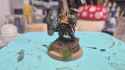
File: 20260416_193253.jpg (954 KB)

954 KB JPG
What you think, good for alpha legion?
Looks a bit goofier than I had imagined...
>>
>>
>>
>>
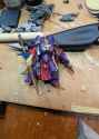
File: lampreys.jpg (133.5 KB)

133.5 KB JPG
Is there any mold or home appliance that one could use to make a lamprey-esque mouth from green stuff for a 28mm model? It's a wonderfully disgusting thing.
>>
>>
File: 1762297264577432.png (149.9 KB)

149.9 KB PNG
>>97899333
>>
>>
>>97899340
Thanks :)
>>97899552
Yeah it does clash quite a bit with the rest of the model, I'll try see if I can find some bits. Also plan to make the scales the same silver as the metals on the body so that should help too hopefully.
>>
File: IMG_0529.jpg (4.1 MB)

4.1 MB JPG
>>97897985
Finished my last Heavy Weapons team
>>
File: IMG_0530.jpg (4 MB)

4 MB JPG
>>97897985
Some metal Kasrkins, any tips on these would be appreciated
>>
>>97899927
Stop drybrushing everything.
Thin your paints.
Clean up the mould lines.
Actually learn how to paint models, anon. The GW workflow of "basecoat > wash > highlight" is not a bad place to start, but don't take it as gospel, especially once you inevitably start getting better.
>>
File: cenobite.jpg (554.6 KB)

554.6 KB JPG
Real rough WIP of a Cenobite, for my WFRP campaign. I'd love some feedback before I hit it with the sanding sponges.
>>
File: cenobite2.jpg (451 KB)

451 KB JPG
>>97900111
Another angle.
>>
>>
>>
File: 13bf8368cf586af86cf928ae1cbc4da4.png (456.3 KB)

456.3 KB PNG
>>97900127
I based it off the career art. It's supposed to be an alms cup out of a skull. I'll make it a little clearer with the plasticard plank, but I could do with some coins to make it clearer. I like the whip swing, gives the pose some aggro while still not being an action pose.
>>
>>97899927
you need to spend more time in the planning stage before you start slopping paint on. look at each part of the model and ask yourself "what is this supposed to represent?" figure out what is a gun, what is armor, what is a grenade, etc. then ask yourself "what is this supposed to look like?" what do you imagine each thing is made out of? is it metal, is it plastic, is it some sci fi material? when you have figured all of this out then you can start putting paint down to match the conceptualized image you have created. when I look at your work all I see is a mess, because you jumped right to putting color down without considering what you were trying to depict.
>>
>>
>>
>>
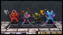
File: KillTeam_descript.jpg (4.4 MB)
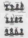
4.4 MB JPG
Kill Team ready (for 4th edition). Only the commissar is left.
A squad of spares, possibly Afriel Strain, or just the pale ghosts of the fallen.
It was a fun project to kitbash something interesting out of cadian bodies.
>>
File: chaoswarriors.jpg (1.3 MB)
1.3 MB JPG
Finished my Chaos Warriors for Advanced Heroquest. Next up are the Chaos Thugs.
>>
File: IMG_20260416_160539.jpg (515.9 KB)

515.9 KB JPG
A little pink to saturate the red.
>>
File: IMG_20260416_160628.jpg (1.2 MB)
1.2 MB JPG
>>97900529
>>
File: image_2026-04-16_192756892.png (1.3 MB)

1.3 MB PNG
Got a bit farther on my first Ulfenwatch. Honestly he's not really speaking to me, I'm not satisfied with how he's coming along. I tried following Vince's verdigris tutorial for the bronze but I'm not super happy with how it came out. There's still way too much shine for the look I'm going for. Does it at least look alright as it is now?
Any suggestions for the shield? I through some brown on just because I had it on the palette but it doesn't do it for me.