Thread #12510287

File: file.png (312.7 KB)
312.7 KB PNG
Well holy shit, this one I didn't know at all.
30 RepliesView Thread
 Showing all 30 replies.
>>
>>
>>
>>
>>
>>
>>
>>
>>
File: 1757728609749.jpg (78.5 KB)

78.5 KB JPG
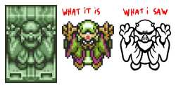
Why was Link fighting Shredder anyway?
>>
File: bl-belt-1517164191.png (1.1 KB)

1.1 KB PNG
>>12510879
My TV was so shit as a kid that I thought the Black Belt in FF1 had a big round clown nose. It didn't help that his weapons and fist came out from behind it, made it seem even more like a nose.
>>
>>
>>
>>
>>
>>
>>12512002
SMW looks much worse than 3 in every aspect except the amount of colors on screen. Mario's sprite in SMW is a straight downgrade. In 3 it has an illusion of actual depth, in SMW it's completely flat and his head remains perfectly still.
>>
File: IMG_0451.jpg (102.2 KB)
102.2 KB JPG
pic related what i saw for many many years
>>
>>
>>
>>
>>12512019
I noticed it right away because I have functioning eyes. The illusion of depth in Mario's sprite in 3 looks really impressive for the NES so I always remembered it, then when I played SMW I was confused as to why his sprite looked so goofy. The whole game has a sloppy, unfinished look to it that ALttP also has.
>>
>>12512021
Guess we’re just polar opposites then. I never liked the standard sprites in SMB3. The red and black combo for Mario was and is ugly to me and making him orange for the fire flower power up is hideous looking.
>>
File: fud-sang-starwards.jpg (30.4 KB)

30.4 KB JPG
I though the shadows were his eyes. Thats what I get for playing on a 14" shitty CRT with RF
>>
>>12512025
If you mean just in terms of colors then SMW definitely wins out, but the SNES could draw way more colors so it would be weird if it didn't. It's the way Mario moves that's weird, because his head and body are perfectly still and he's looking towards the screen, but his body is facing left/right, so it doesn't match. In 3 he's in profile until he starts moving, and then he goes back and forth in a way that gives off a pretty convincing sense of depth, like he's actually there in the game world. SMB3 also has a much more cohesive aesthetic, with the stage play theme throughout, and the enemy designs mesh a lot better together. The sprites in World are like a mishmash in comparison. I never thought World's enemies like the football and baseball guys even fit in with Mario at all, whereas the turtle and pipe themes were pretty coherent in the original (red turtles, green turtles, turtles with wings, turtles in the clouds that throw other turtles, turtles with hammers, plants coming out of pipes, etc.) Why the fuck are there random football and baseball players on a dinosaur island in the first place?
>>
>>12512015
>>12512013
Thee were probably not there, just a twinkle in his father's pile of jizz in the toilet in 1991
>>
>>
>>
>>12512059
The Sonic games had great sprite work looked good, but I could never get into the level design and pinball inspired stuff. Despite their rivalry in the 90s, Mario and Sonic games are wildly different in terms of design.
>>
>>
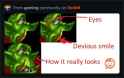
>>12512014
What I saw was similar, though I was more in the beak peon camp, where yeah he was smiling, but the "mouth" (in reality the peon's right tusk) I interpreted as the bottom half of a beak (and the peon's actual lip + cheek were what I interpreted as the green top of the beak). Did it make sense? No, but I was a kid who just accepted things as whatever I initially happened to see, without too much concern for what made sense, because given that it was probably my first exposure to orcs and similar creatures, I really had no preconceived notions of what different varieties of Orcs would look like, so sure, some of them had beaks, why not.