Thread #4491118

File: 585x941x2.jpg (207.2 KB)

207.2 KB JPG
What's the secret to digital b&w photography?
34 RepliesView Thread
 Showing all 34 replies.
>>
>>
Protect your highlights.
Because you're limited to tones of grey, black and white, you need to find subjects where this is beneficial and not a hindrance.
Soft gradients. Shadows. Chiaroscuro and tenebrism. The contrast between light and dark. Black and white photography works well with architecture because it's serves to define structures and features. With models you have to think about it as if you are working with charcoal and paper. Where do you want highlights to be? What are you focusing on? And what do you want to be hidden.
>>
>>
>>
>>
>>4491118
The secret is that colours are incredibly important because they dictate how much contrast each object gets. Doubly so if using colour filters (you should be) and even MORE so if you're using special film stocks that can be more or less sensitive to certain colours. It's a decietfuly simple concept since at first glance you go "it must be simple there's only black grey and white hue hue", but balancing the contrast in your overall composition, your foreground and background, and your subject are all important and easily fucked up.
And then there's black and white snapshits that are simple and throw all that theory out the window because muh nostalgic and muh filmic vibes. They still tend to look "nice" because it's much easier to view a black and white photograph as removed from reality since, well, reality is in colour.
There's also the plain fact that removing colour from a photo forces you to focus on the other elements that do or don't make the photograph good. This is why selective-colour chuds are dunked on so hard here: you're forcing an easy way to highlight your subject via software instead of actually putting thought into it.
This becomes a bit of a moot point if you scan though because then you can just chuck up some post-processing.
>>
>>
>>
>>
>>
>>
>>
File: GR001435_resized.jpg (3.6 MB)
3.6 MB JPG
>>
>>
>>
>>

>>
>>

>>
>>
File: 1766927401.jpg (73.6 KB)

73.6 KB JPG
>>4491166
Thing is, human eyes can adjust lacking dark areas with imagination but can't do it on highlights well...
>>
>>
>>
>>

>>
File: CY-Zeiss-Sonnar-T-135mm-f2.8.jpg (2.3 MB)
2.3 MB JPG
Older lenses with less control for flaring, fringing, and other color aberrations may have some pleasantly unexpected effects when it comes to how they handle high-contrast lighting (ie. garish colors become smooth light rolloff instead). Picrel.
>>
>>
File: Zone_system.jpg (280.3 KB)

280.3 KB JPG
>>4496146
Kind of true.
Most people just obsess about BnW genre rather than it's functionality which does real job actually.
One has to focus on expressing his intentions. It's simple as that.
Thankfully, Ansel Adams made a system that we can approximate our prevision with so we can be more precise.
>>
>>
>>
>>
>>4496500
I guess you are kinda right. I almost fell for the GRIV monochrome. Instead I did a month of shooting only b&w and realized it's just a meme. My family ask me to send a color version of photos "but why is it black and white??". I compare both and color is always a bit nicer. The warmth of sunlight, deep greens in nature, skin toans. It's such a pleasure to see color. Probably why all movie directors immediatelly abandoned b&w when finally color film was around. It's just more alive.
>>
File: dog-pointing-finger.gif (50.6 KB)

50.6 KB GIF
ha people say this and that about art but black and white photos are rly good for home decor, easier to match with stucco n sutff
all b&w, contrasty, got stuff in every incel adams zone, put a matte around it, keep it small, get a few, mostly boats and women
maybe some mountaintops
i like montaintops, they're the tits of the earth
that's the stuff i like, sets of them
>>4491707
square crop, hasselblad it, then that's the stuff lol cant beat the classics
>>
File: 1000010644.jpg (287.2 KB)

287.2 KB JPG
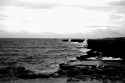
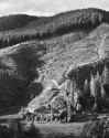
>>4496502
>It's such a pleasure to see colour
Not to be a pretentious fag but idk, I don't think that a photo should always simply aspire to be "pleasant" to look at. Black and white creates an effect that can be used artfully. I agree, I "enjoy" looking at colour photos more than I do black and white photos 9 times out of 10, but sometimes I do see a black and white photo and realise "colour wouldn't work for this". Picrel is an example, I've seen pics of this place in colour and idk, the B&W just works imo. Maybe I'm just being a pretentious wank though, should never rule that out.
>>4491122
What's said here about how it forces focus on form and tone, which lends it to architectural photography where maybe colour might be something you want to sacrifice to emphasise something else.