Thread #3927353

File: 9ozj263rer8b1.jpg (278.5 KB)
278.5 KB JPG
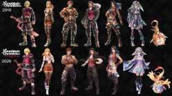
Why did Xenoblade's art style change?
25 RepliesView Thread
 Showing all 25 replies.
>>
>>3927353
I don't see any change. It's still ugly, garish, chaotic and nonsensical asiaslop. None of those outfits even look remotely like garments. It's just random shapes with random colors, failing utterly to flatter the figures of the characters or to distinguish them from each other. There is no story told there. You can't tell by looking what or who any of those people are. They're just hideous agglomerations of random noise.
Fucking ugly. It's the amateur bullshit you'd see in a middle school art class being scribbled by the nonverbal fat kid in the back of the room with the emo swoosh tsunami hairstyle in 2026... and he's always wearing a chain with a medallion of sonichu cobbled together out of sculpy and chunky acrylic paint.
>>

>>
>>
>>
>>
>>
>>
>>
File: 12.jpg (999.1 KB)

999.1 KB JPG
xenoblade was drawing inspiration form western rpgs which is why it looked different and had a mmo style battle system.
It's no wonder it was a bigger hit in the West than it was in Japan. But now it wants to be trails of
It's not just the artstyle that looks worse but the remake even has less detail.
Looks like they smeared vaseline over the screen
>>

>>

>>

>>
>>
>>
>>
>>
>>
>>
>>
>>
>>3927353
How many people know the first artstyle of the game was just some intern armor designer and not an actual character designer? It wasn't gonna stay in the first place.
Also if you're going to cry about the Xenogears artstyle being gone, too bad, you didn't like X enough to keep it around.
>>
>>
>>3927353
So I never played Xenoblade because am poor and busy, but I do have a failed art degree... which further leads to me being poor and busy.
Using the knowledge I have from that, I think I can see why the designs were changed. The top designs are so busy and filled with so much noise that we're losing the shape of the form in some places. For example the character that's 3rd from the left... orange looking... since his legs are completely apart it reads just fine. If you look at the leftmost character on the top row... it's almost like he's wearing a skirt. Meanwhile the bottom row leftmost character you can still read the fact he's wearing shorts due to the far less busy design. Continuing to use this character, there's this zig-zag lavender pattern that bands around his waist. If we look up to the top row... if I didn't know to look for it I wouldn't see it at all because it just gets completely lost in the noise of the design.
That said, neither rows are outright awful. They're just different. Top is a bit more noisy. Bottom is a little more simple.
>>
>>
>>3935116
The designs themselves are exactly the same. The difference is in art style, the top has more shading and unique facial features while the bottom is simple shading and stock standard featureless anime faces